preloader

Project overview

This project was originally developed in Spanish, though it is presented in English for international publication purposes only.

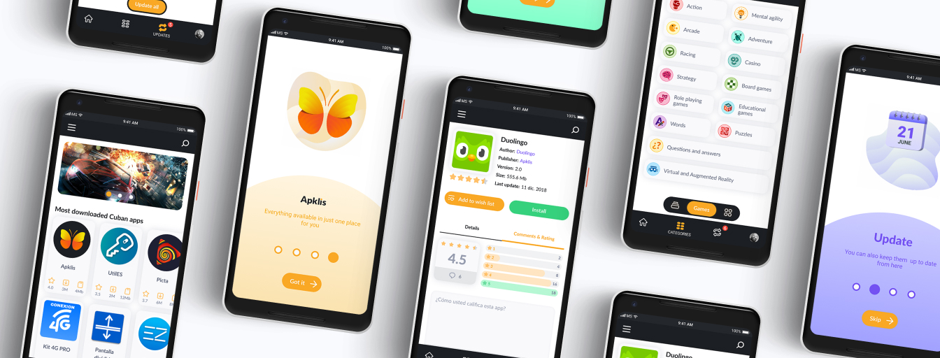
Project overview mockups

The product

Apklis, an Android app store to meet the Cuban people demand due to a growing popularity of mobile technologies.

Responsibilities

I was in charge of brand design, UX Research, UX Writing, Wireframing, Prototyping, Motion Design and UI Design.

The problem

Big solutions like Google play and Apkpure are not widely accessible for Cubans due to the US Embargo and lack of high-speed connectivity. So, Apklis was an idea that emerged as an alternative to these applications, mainly for Cubans.

The goal

Design an app store with Web version and Android native version to supply Cuban needs and allow Cuban developers to commercialize their apps.

My role

Lead Designer, but being the only designer in the team, I actually covered all the design roles.

Project duration

I was working on this project from July 2018 to September 2019.

Brand design

Brand concept

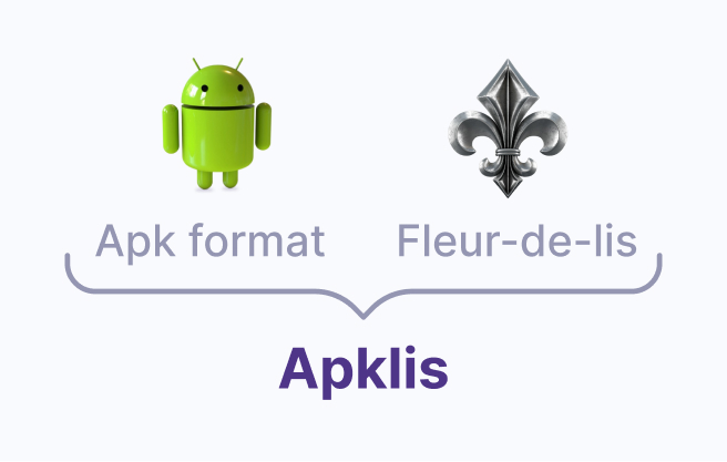
The essence of the brand is sovereignty. The name Apklis was formed by “APK” that being the extension of the Android applications creates a conceptual link with the objective of the product; and “lis”, which is derived from fleur-de-lis, an ancient symbol that represents sovereignty.

Icon sketching

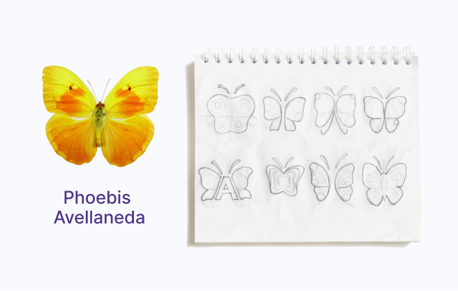
A visual synthesis of the Cuban endemic butterfly, Phoebis Avellaneda was taken as an icon, which reinforces the concept of Cuban sovereignty.

Icon construction

The icon shape was constructed using six circles whose diameters are multiples of 4. The circles were repeated to achieve the desired shape. The colors are representations of the true colors of the Phoebis Avellaneda butterfly.

Final result

The result is the combination of the icon and the name, which was made using Lato font with some variations.

Getting to know the user

User research summary

Apklis was an idea that emerged as an alternative to Google Play and Apkpure mainly for Cubans. With this in mind, I began the research by asking questions on the street and on social media to people from different social groups about their experiences using these applications that were already popular.

Pain points

Too much publicity

Interviewees find annoying having to see a lot of suggestions and publicity. They can be there but with moderation.

Lack of Cuban apps

Users have to access Cuban applications by different means, either by downloading them from unsafe sites or by searching for them on the internet.

Hard for developers to publish

Cuban application developers find it practically impossible to publish their products in foreign stores thanks to the US embargo, so they do not have a means to profit from them.

Unreliability

Users have to access Cuban applications by different means, either by downloading them from unsafe sites or by searching for them on the internet.

Problem statement #1

Laura is an altruistic young student who needs an all-in-one place to keep her apps updated because there is not a reliable apps store for Cuban market.

Persona: Laura Martínez

Age: 22
Motto: “Helping others fills me with joy”
Education: Third year of university
Hometown: Havana, Cuba
Family: Mom, Dad and a dog
Ocupation: Student
Description: Laura is in her third year of college. She adores her cell phone and in addition to playing games with it, she also solves everyday tasks like paying bills and doing checklists. Her elders come to her for advice on using technology, and she enjoys helping them. Although she tries to keep up with the latest versions, it is a recurring problem that the Cuban applications that she uses cannot be easily updated.

Goals

  • Easy way for non-tech-savvy people to access Cuban apps.
  • To be able to update all my apps, Cuban and foreign ones in one place.

Frustrations

  • Often, even if I explain someone in detail how to get an app, it is hard because there is not only one way to do it, right now you have to find it in the wide internet.
  • I can’t update my Cuban apps and games reliably.

User journey map: Laura Martínez

Goal: Update Cuban apps installed on her phone.
Action Task list Feeling adjective Improvements opportunities
Select app to update
  1. Find in the phone which app needs to be updated.
  2. Select one.
  • Hopeful
  • Confused
  • Feature to list outdated installed apps.
Find the app in internet
  1. Look for the app in internet.
  2. Try to find it in a secure site.
  3. Find reviews from other users about the reliability of that site.
  • Fearful
  • Bored
  • Lost
  • Better wayfindings.
Download app
  1. Check if in fact there is an update for the app.
  2. Download app.
  • Hopeful
  • Happy
  • Feature to list the available updates.
Install app on device
  1. Install app.
  2. Find out if that version is compatible with the owned device.
  • Hopeful
  • Nervous
  • Feature to provide only compatible updates.
Give feedback to developer
  1. Find out if there are social network pages to give feedback to the developer.
  2. Write and send opinion and wait for response.
  • Bored
  • Indifferent
  • Feature to rate apps.
  • Feature to write reviews about experience with apps.

Conclusion after Laura's journey map

According to the users represented by this person, a centralized site is needed where Cuban applications can be found. It is also important to be able to install and keep them up to date easily.

Problem statement #2

Roberto is a software developer who needs a platform to safely sell his products and get feedback from his users because there is not a service like that for Cubans developers in the market.

Persona: Roberto Cruz

Age: 45
Motto: “Creating useful applications helps move society forward”
Education: Computing engineer
Hometown: Havana, Cuba
Family: Wife and two kids
Ocupation: Software developer
Description: Roberto is a proficient software developer. His profession requires him to be creative and innovative to create apps which solve real problems, and he loves it. For him, this is a way to make a better world by giving people the tools to solve common issues. But often he struggles with the fact that in Cuba there is not a platform to publish his products.

Goals

  • To be able to publish apps.
  • Get revenue from published apps.
  • Get feedback from users.

Frustrations

  • I don’t have a reliable way to reach as much people as possible.
  • It is hard for me to cover my expenses because the revenue from my products is not stable.
  • I don’t know what the users think about my apps.

User journey map: Roberto Cruz

Goal: Publish software product, get revenue and feedback from users.
Action Task list Feeling adjective Improvements opportunities
Find a site in internet to publish or create one
  1. Search for available services to publish from Cuba.
  2. Or create own site or blog to publish.
  • Discouraged
  • Lost
  • Hopeful
  • Service to publish apps.
Create publicity for the product
  1. Create pages in Social Networks to show products.
  2. Buy advertising in Social Networks.
  • Creative
  • Enthusiastic
  • Feature to announce the latest releases.
Get pay by the user
  1. Include feature in app to block it till the user pays.
  2. Include in app payment info.
  • Hopeful
  • Expectant
  • Service to sell apps.
Get feedback from users
  1. Review Social Networks comments to find out what users think.
  2. Answer users questions.
  3. Create polls to have quantitative feedback.
  • Motivated
  • Open-minded
  • Feature for users reviews.
  • Feature for ratings.
Interact with users
  1. Using Social networks find out user's most wanted new improvements and features.
  2. Provide updates announcements.
  • Helpful
  • Feature for users opinions.
  • Feature to list outdated apps.

Conclusion after Roberto's journey map

After analyzing this persona, a clear goal is to allow Cuban developers to publish and commercialize their applications. In addition to creating a direct channel of communication with end users to get valuable feedback that will translate into better products.

Competitive audit

Google Play and Apkpure (apkpure.com) were analyzed as direct competitors. From this study it was concluded that their information architectures are correct, mainly the categorization of the apps published there, for example the differentiation between games and applications for another purpose. The market gap they leave is that they do not cover the Cuban public, which will be taken as an opportunity by Apklis.

Information architecture

For the information architecture more categories where defined, this is a reduced version of the full diagram.

Starting the design

Web app exploration

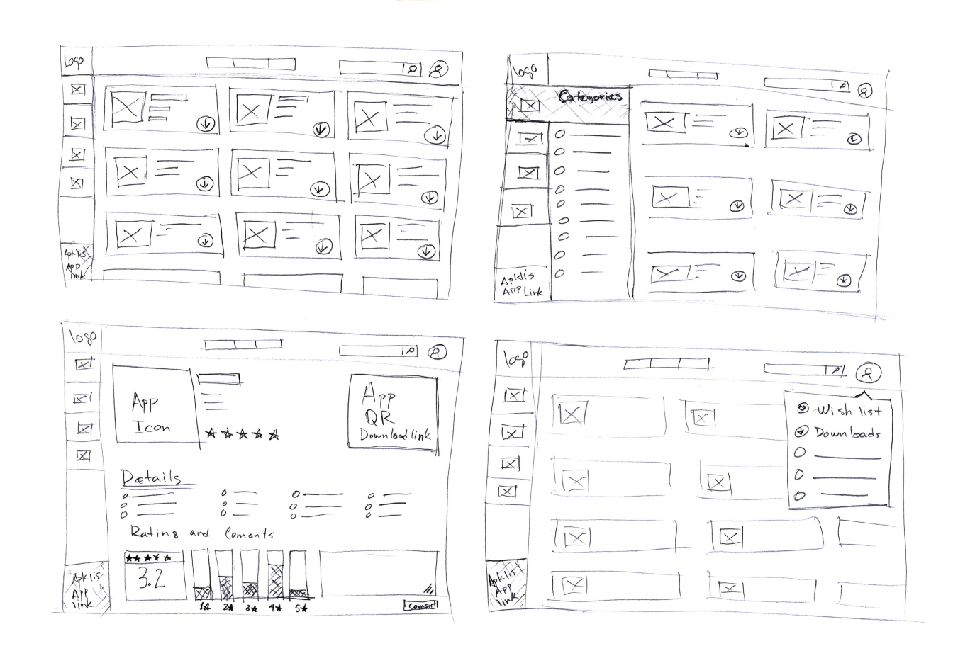
Paper wireframes exploration #1

The goal here was to explore which layout could fit better with the web app objective and information architecture.

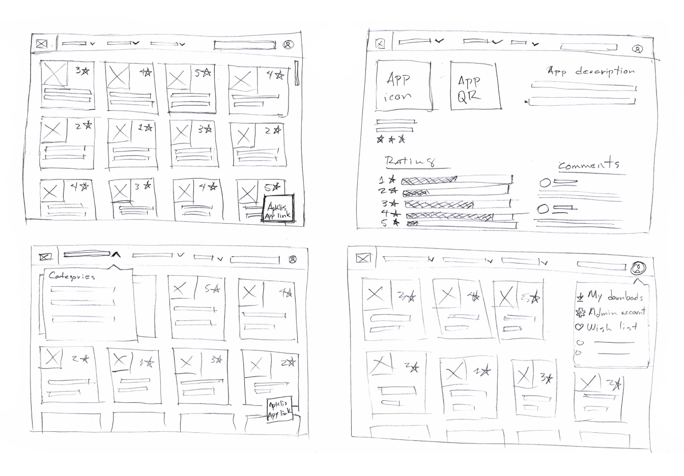
Paper wireframes exploration #2

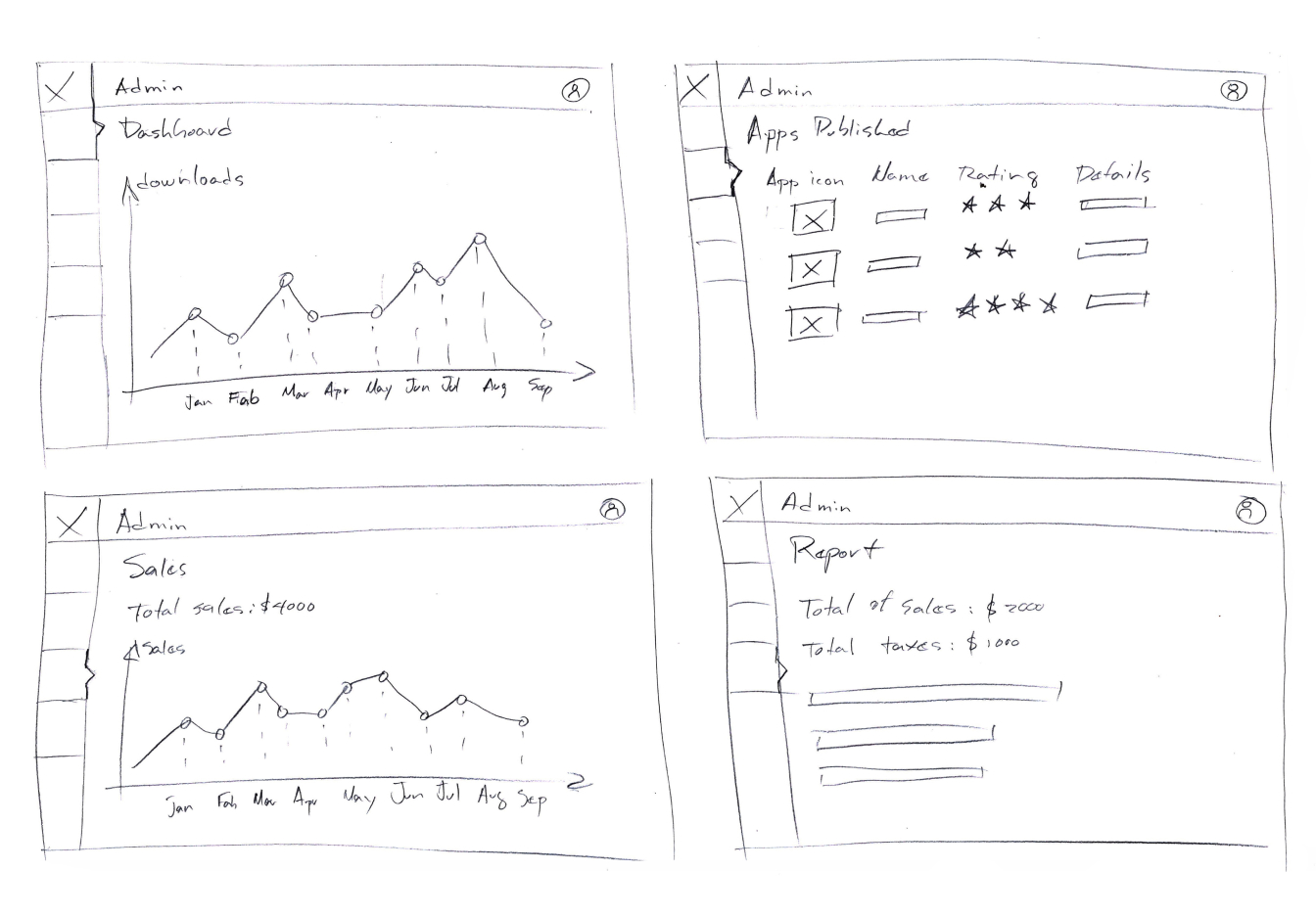
Paper wireframes exploration #3 (Developer views)

This draft shows the Admin section, which will be available only for users with developer accounts. From here, developers can see insights from their published apps.

Web app digital wireframes

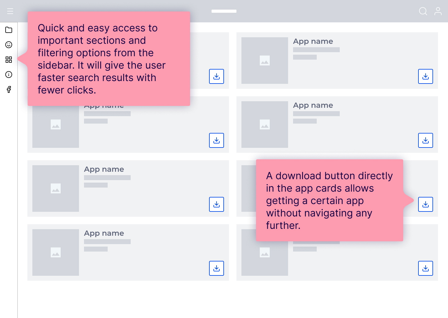
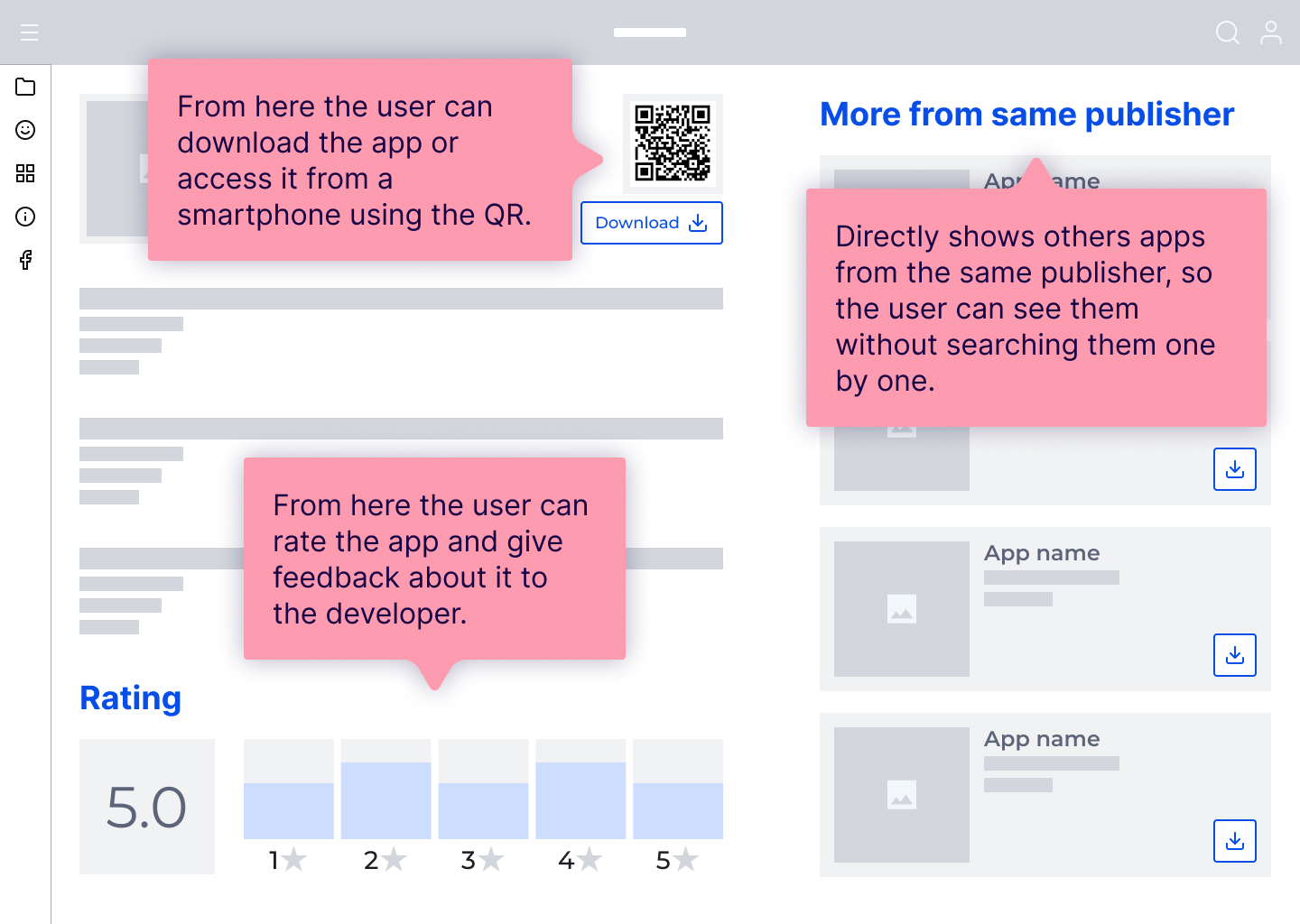
The pursued goal here was to allow accessing main features with as less interaction as possible. At the same time the detailed view of a certain app allows more interaction in its scope and gives developers the chance of gathering feedback about their publishing.

Web app low-fidelity prototype

The flow is simple, from Home page it is possible to reach an app detailed view, filtering and going to Developer view.

Mobile app exploration

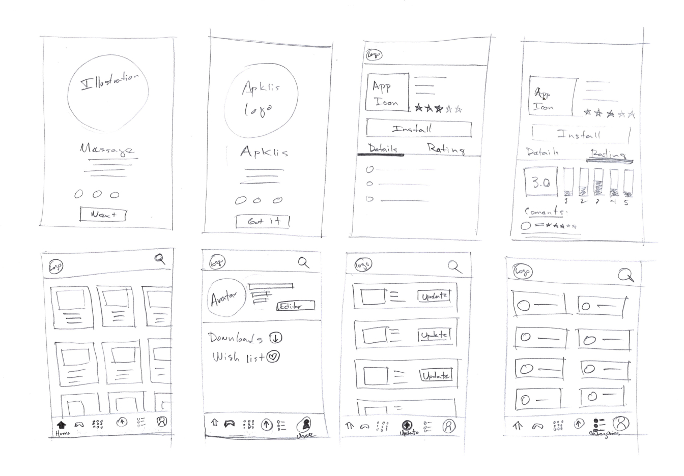
Paper wireframes exploration #1

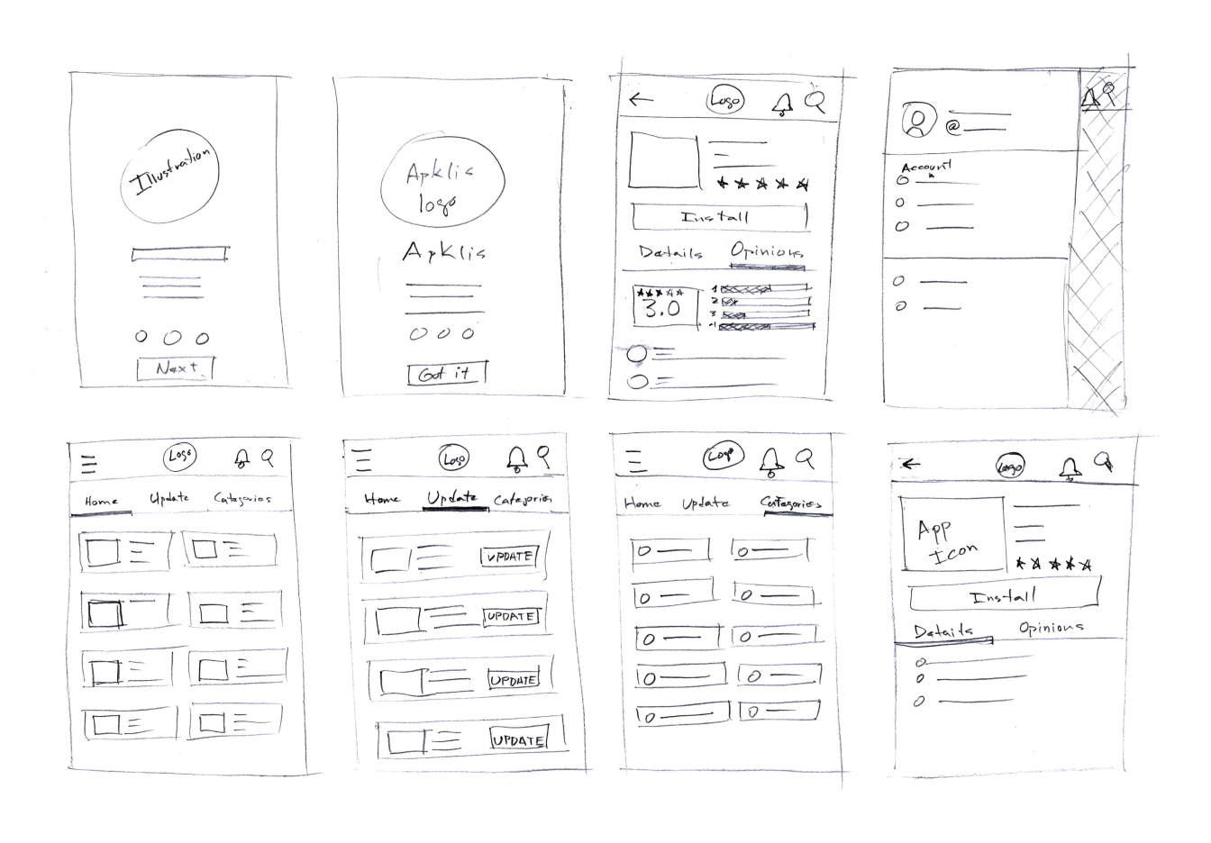
The desired result here was to organize the existing applications same as in Web app and add a bottom bar to quickly reach the main app sections.

Paper wireframes exploration #2

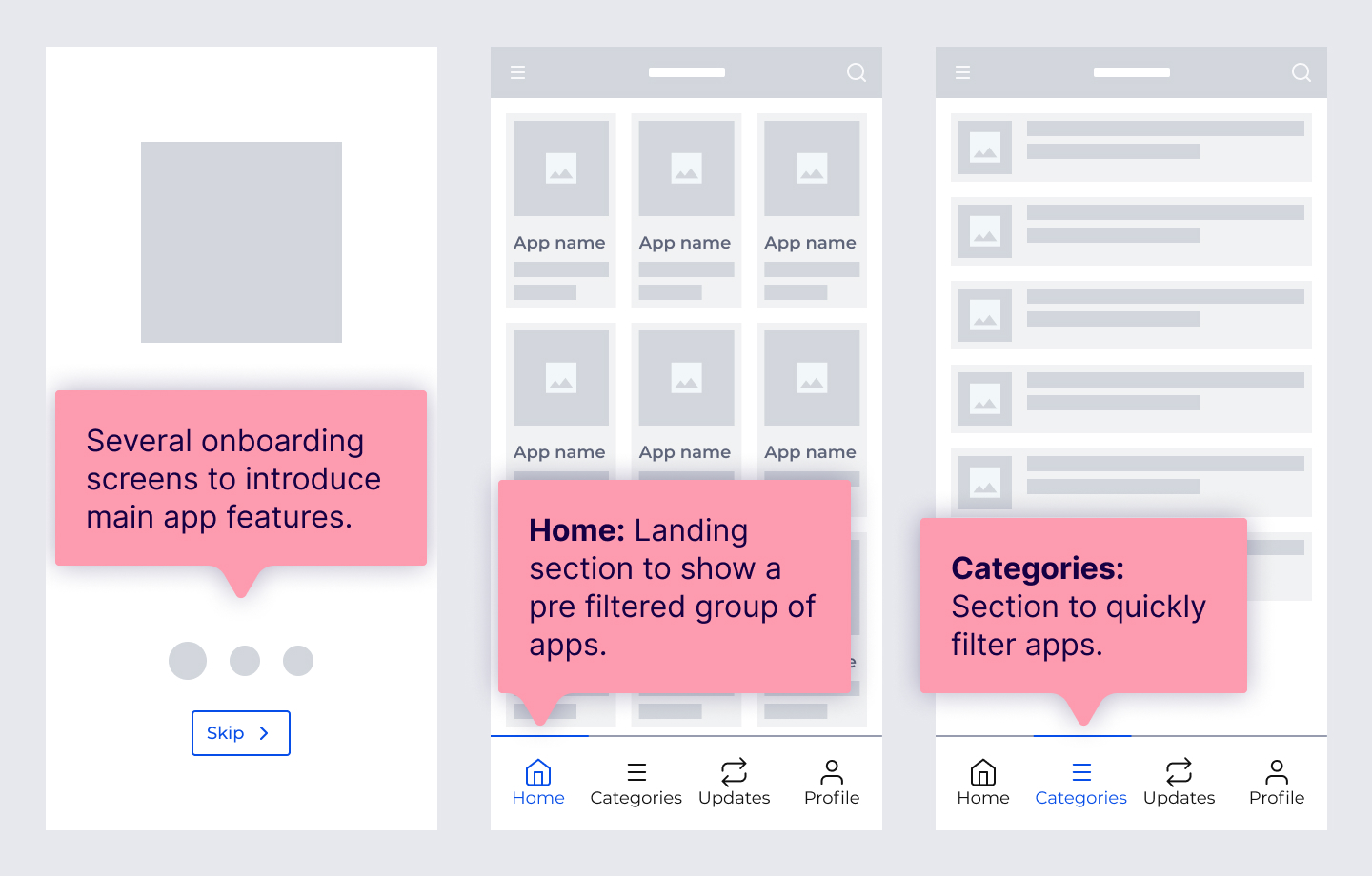
Mobile app digital wireframes

Here the intentions were presenting the app with onboarding screens, so the user lands in what it can offer. Furthermore, giving quick access to main features without multi level navigation.

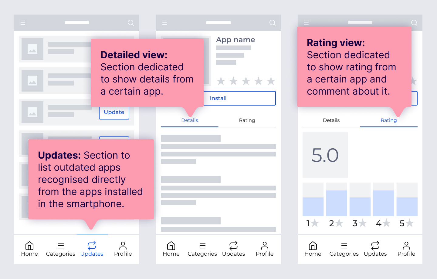
Mobile app low-fidelity prototype

A straight forward flow, with just two navigation levels. After onboarding, from Home view, the rest of sections can be accessed and also the apps detail view from where they can be installed and rated.

Usability study findings

Using the Low fidelity prototypes done in Figma, it was possible to test in real devices, so several users were asked to interact with them to gather insights.

1Users could navigate easily across the web app and the android app.

2It was easy to download an app in web app.

3Find an app detail view and install it in the android native app was a straight forward flow.

4An admin view helps developers get insights about their publishing.

5The way to rate and comment about an app to interact with its developer was perceived as usable.

6I was in charge of brand design, UX Research, UX Writing, Wireframing, Prototyping, Motion Design and UI Design.

Refining the design

Web app high-fidelity prototype

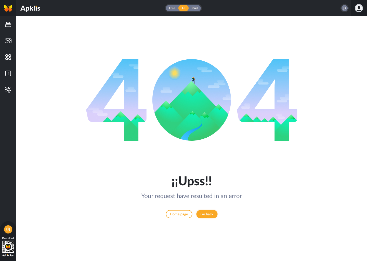
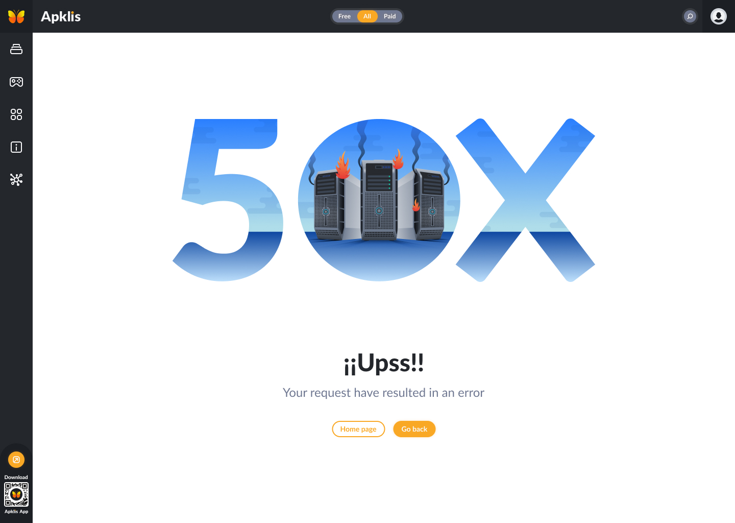
Error pages

Mobile app high-fidelity prototype

Accessibility considerations

1The hierarchy of sections, titles and navigation was carefully revised so that when optimizing the application for screen readers, the feedback was accurate and according to what exists on the screen.

2The option to record comments was added in the functionality of evaluating an app, to facilitate that people with writing problems could also give their opinion.

Going forward

Takeaways

Impact

This product has a web version and an android native app; the firs one is widely used and accepted by Cubans and the second one counts with 7 588 121 downloads till December 7th, 2021. The impact has been really positive and the product’s objective was fulfilled, mainly because now Cuban developers can sell their apps there.

What I learned

Through this project I was able to get started in the world of software development and understand how the industry works. It was my first professional experience in a team where I was able to practice my communication skills and to work in tandem with other engineers. It opened my mind and made me confirm my love for product design.

Next steps

1During the first version of the product, it was made only for Cubans which native language is Spanish, so in further updates one of the steps to follow is internationalization. Including other languages will make the product grow and be used by foreign people.

2Coming back to the product and make a full review with an accessibility approach.

Check other works